To make the tables responsive and fully understandable on mobile devices, we do the following:
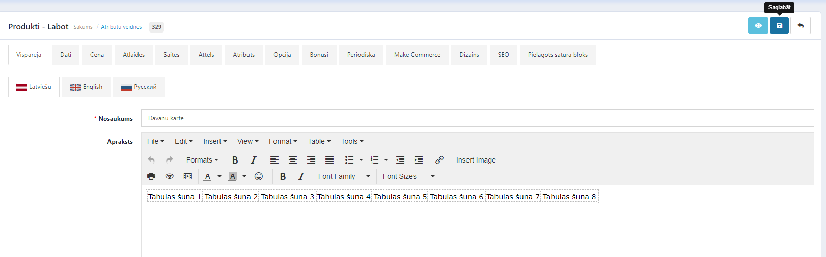
1. Make the table itself with the corresponding number of rows and columns. It can be either in the product description, information page or category description.
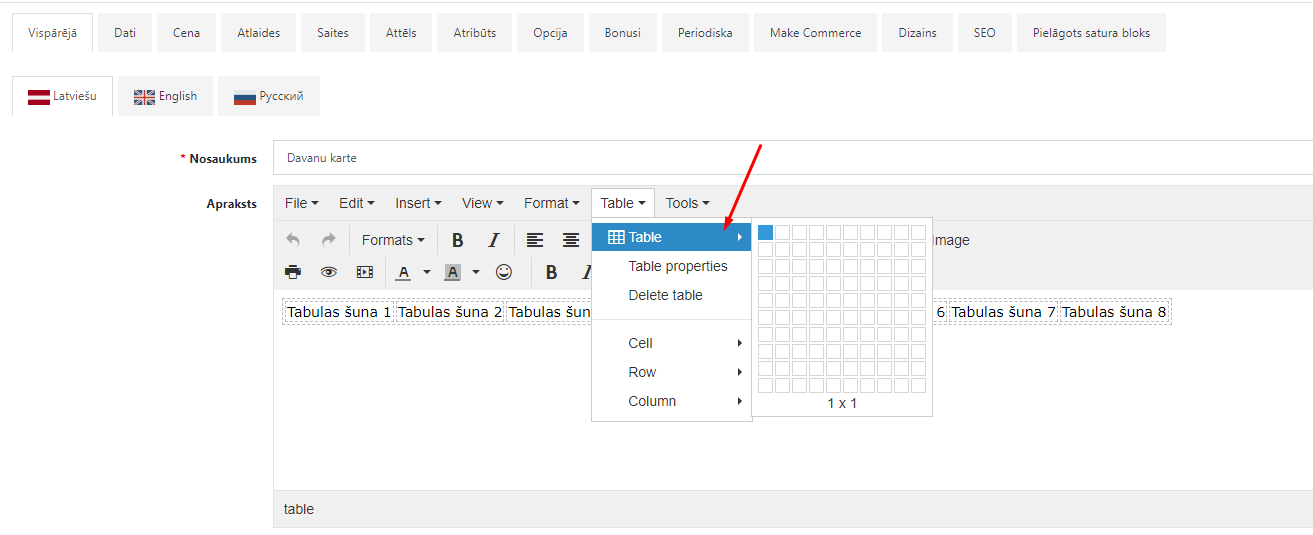
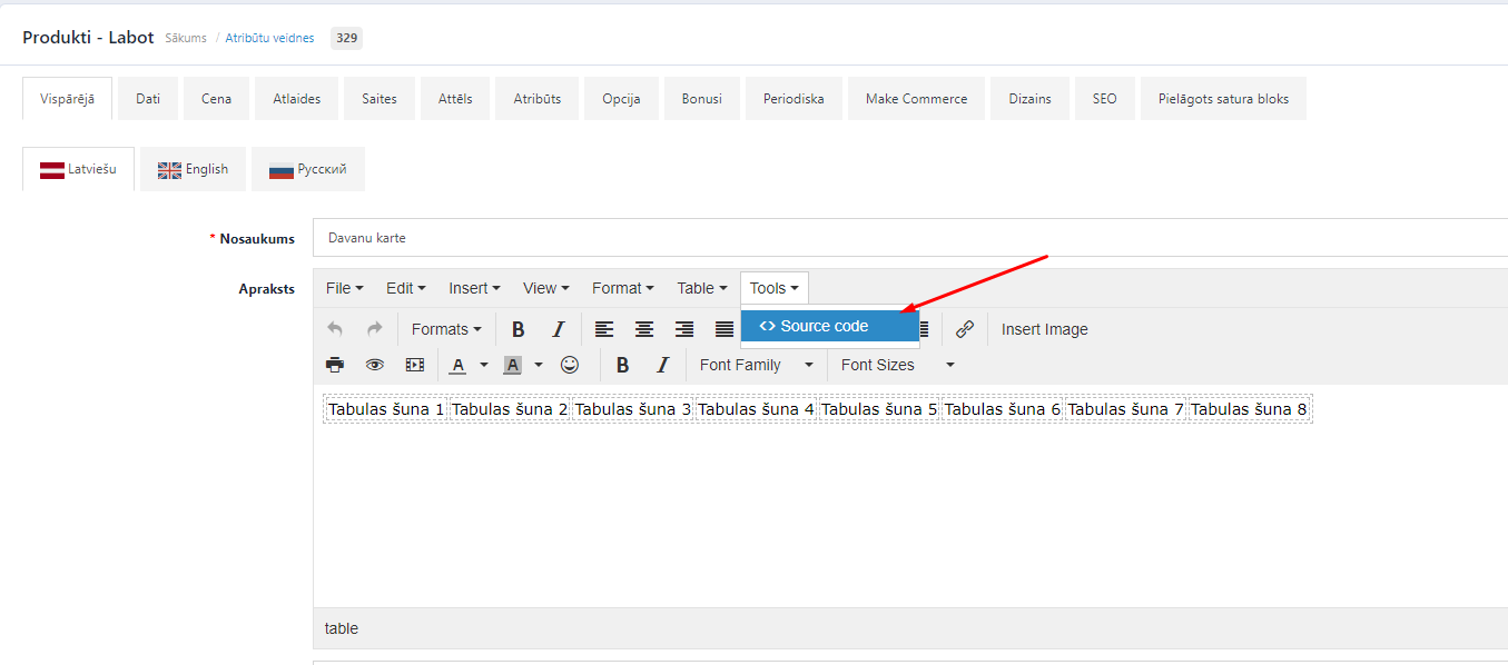
2. When the table has been created, click on Tools >> Source Code section.
3. In the opened code view it is necessary to define a class for the table by adding this line: - class=”table-responsive”.
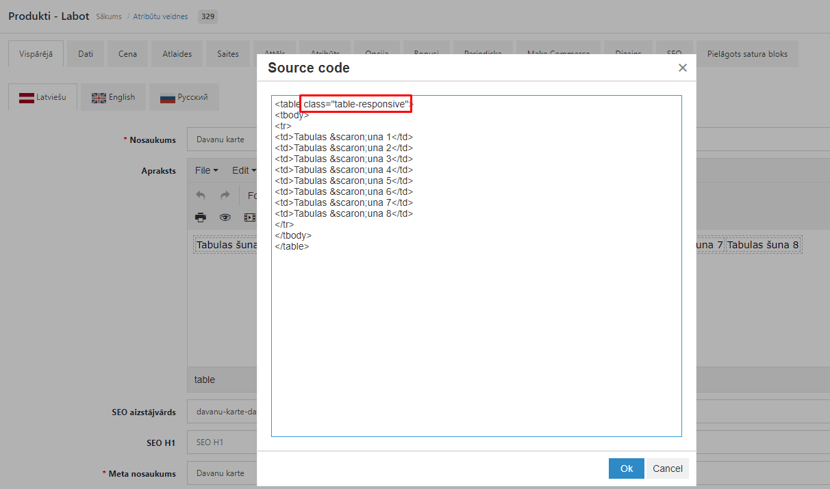
4. When that has been done, click the Ok button and save the changes.
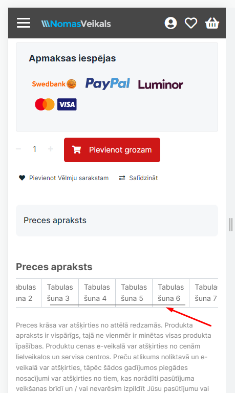
5. A horizontal scroll bar will added to the table, which when moved to the right or left, the table can be viewed in full on mobile devices.